三、Flex 布局
- 基本概念
- Flex容器: 通过
display: flex创建,控制内部项目的排列方式 - Flex项目: 容器的直接子元素,自动成为Flex项目
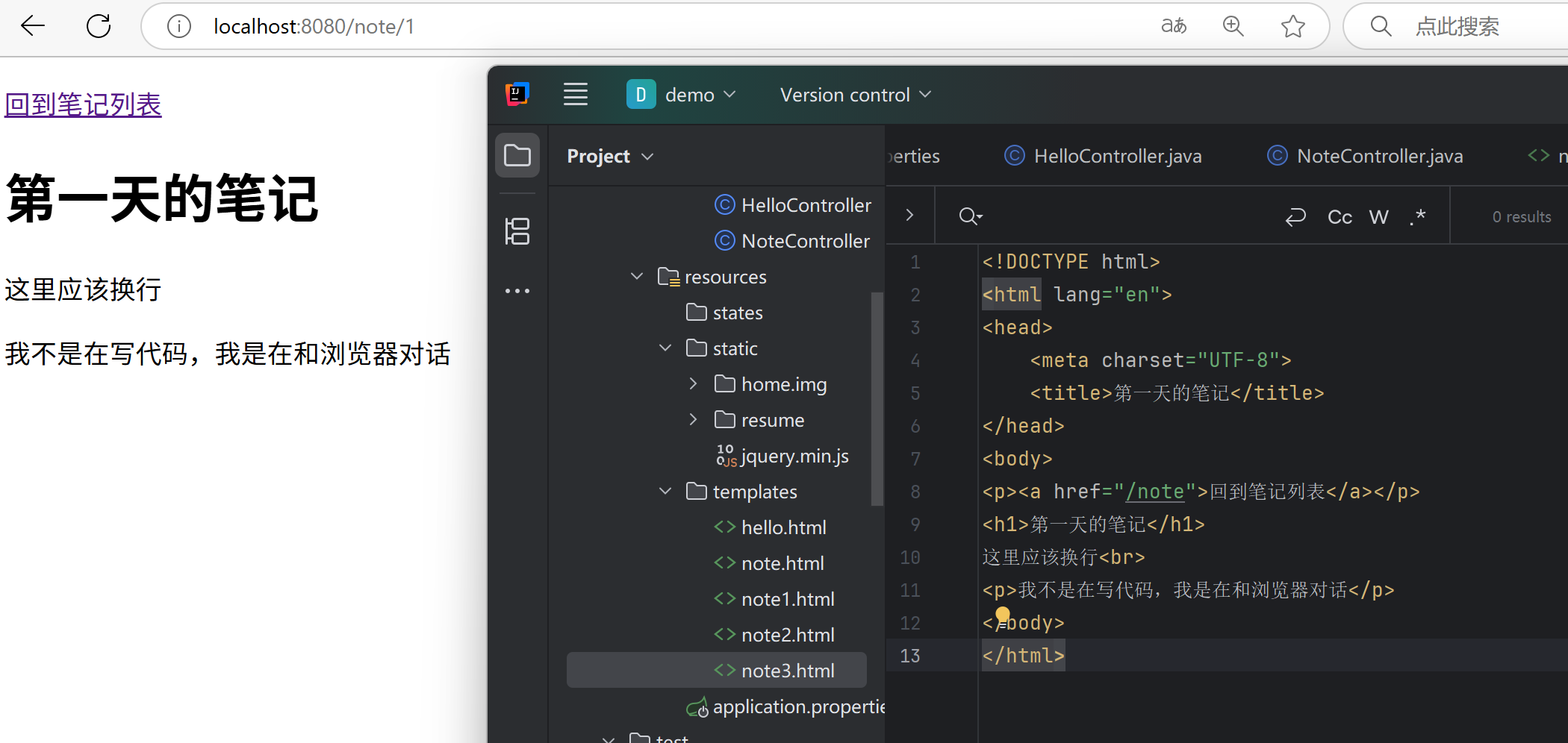
<div class="flex-container"> <div class="item">item1</div> <div class="item">item2</div> </div> - Flex容器: 通过
- 主轴(Main Axis): 项目的主要排列方向,由
flex-direction决定 - 交叉轴(Cross Axis): 与主轴垂直的方向,控制项目在垂直方向的对齐
- 容器属性
flex-direction- 定义主轴方向:<style> .flex-container { flex-direction: row; } </style>row(默认,水平排列)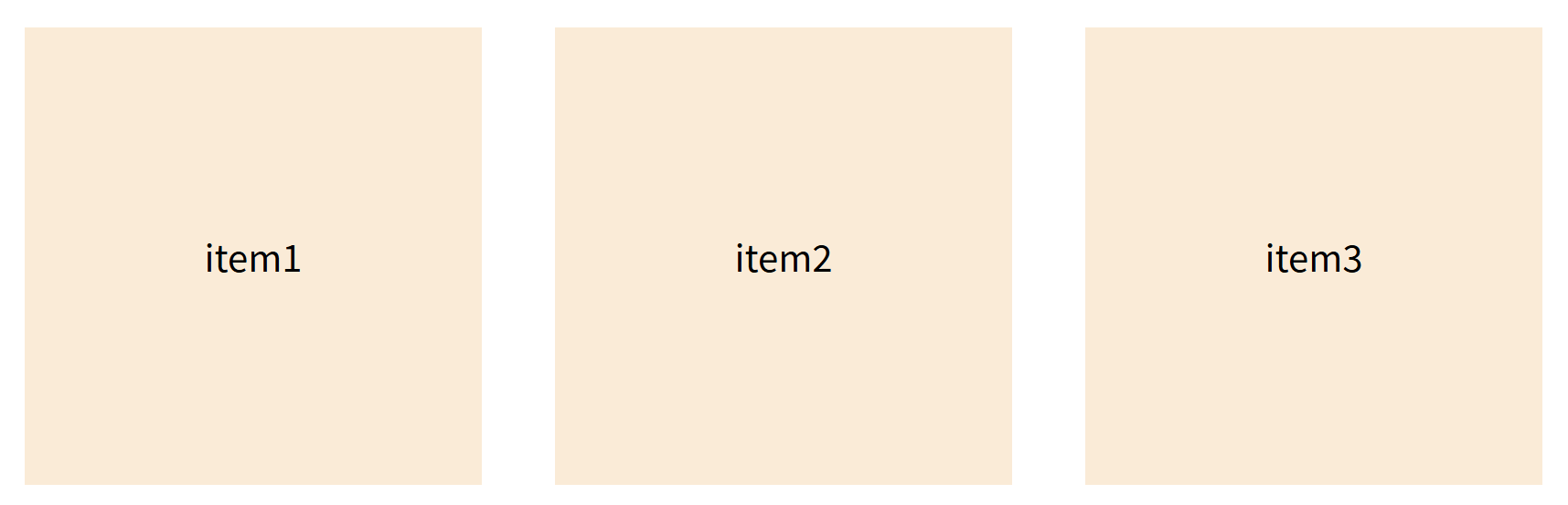
row-reverse(水平反向排列)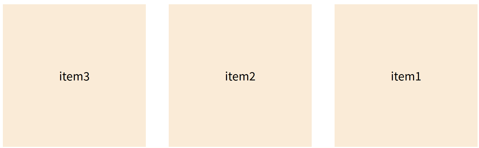
column(垂直排列)
column-reverse(垂直反向排列)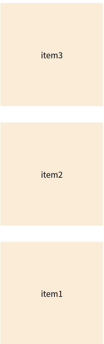
flex-wrap- 是否允许换行:nowrap(默认,不换行)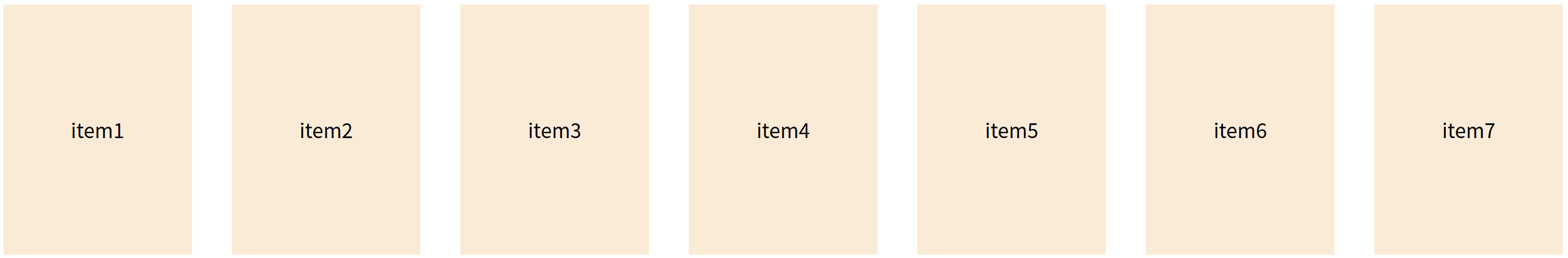
wrap(换行)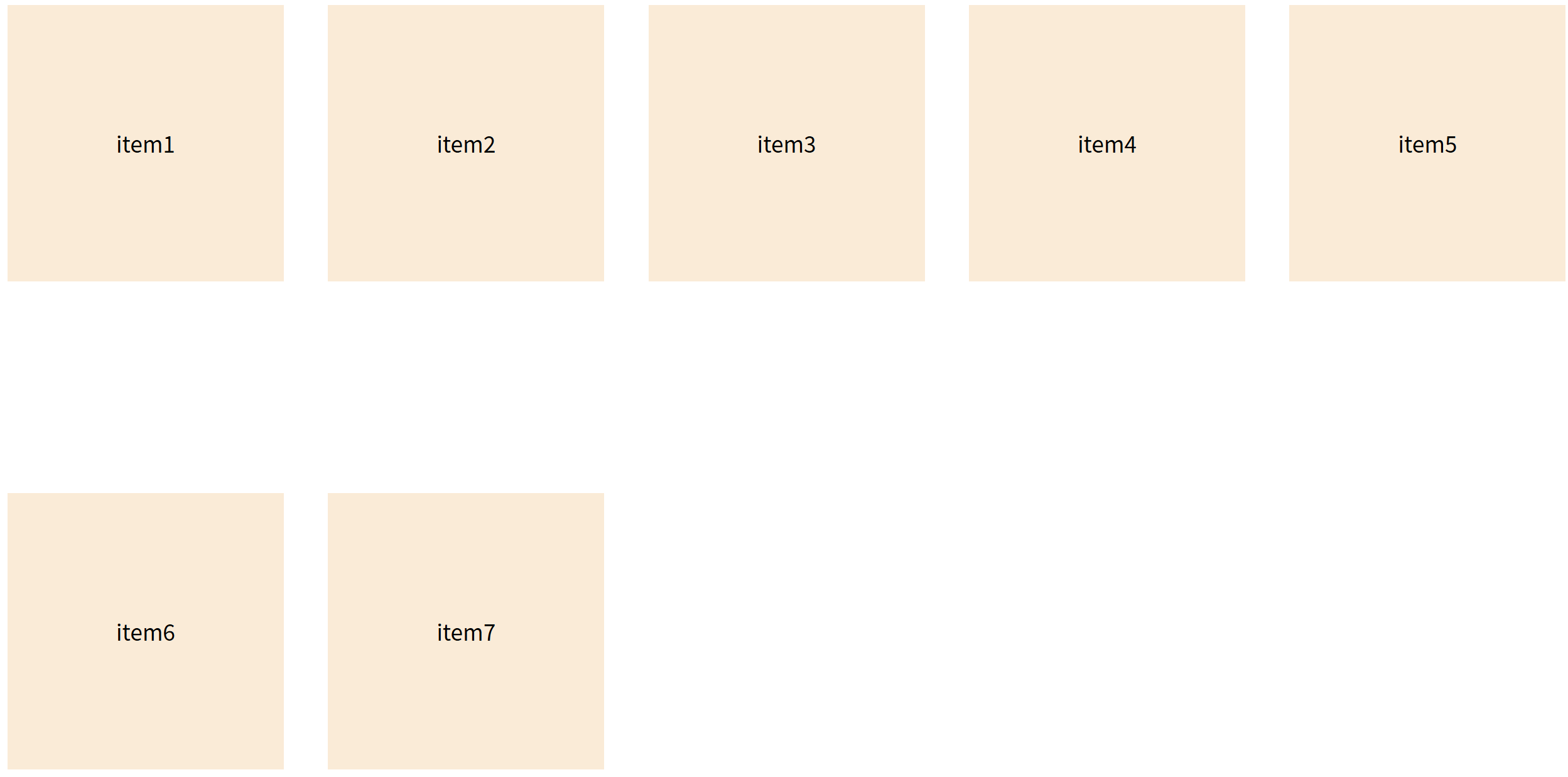
wrap-reverse(反向换行)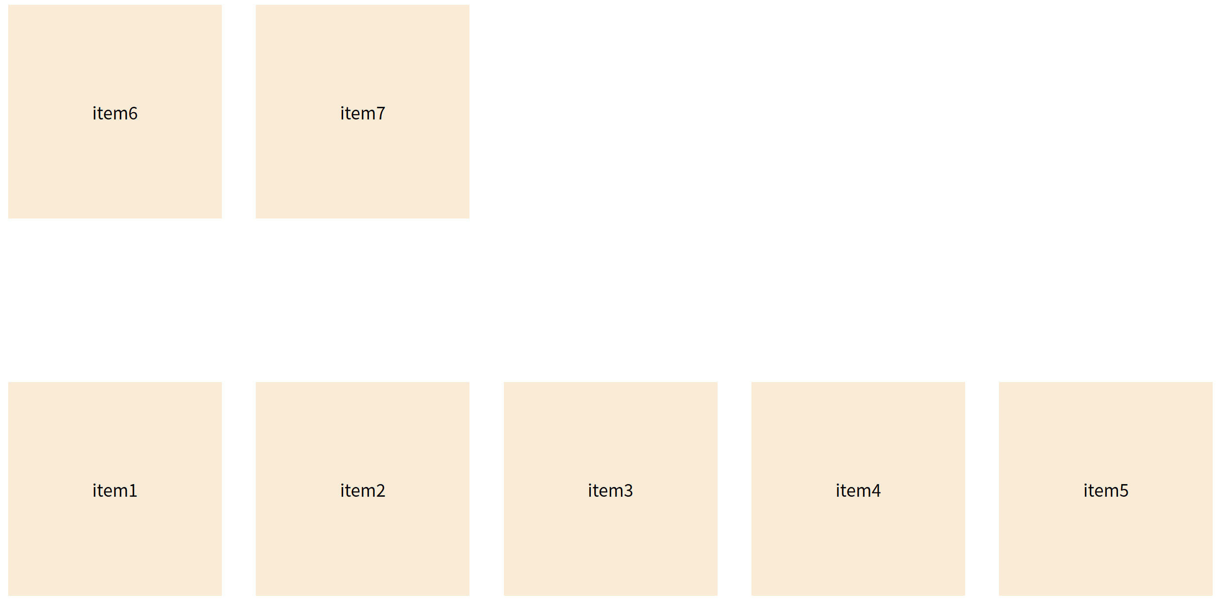
justify-content- 主轴对齐方式:flex-start(默认,左对齐)flex-end(右对齐)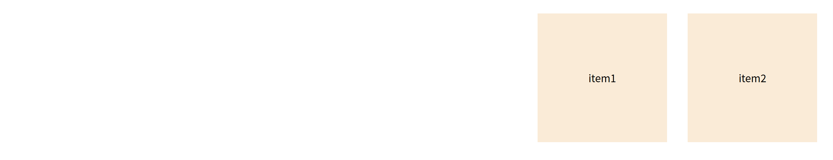
center(居中)space-between(两端对齐,项目之间的间隔都相等)space-around(均匀分布。每个项目两侧的间隔相等,所以项目之间的间隔比项目与边框的间隔大一倍)
align-items- 交叉轴对齐方式:stretch(默认,拉伸)flex-start(顶部对齐)flex-end(底部对齐)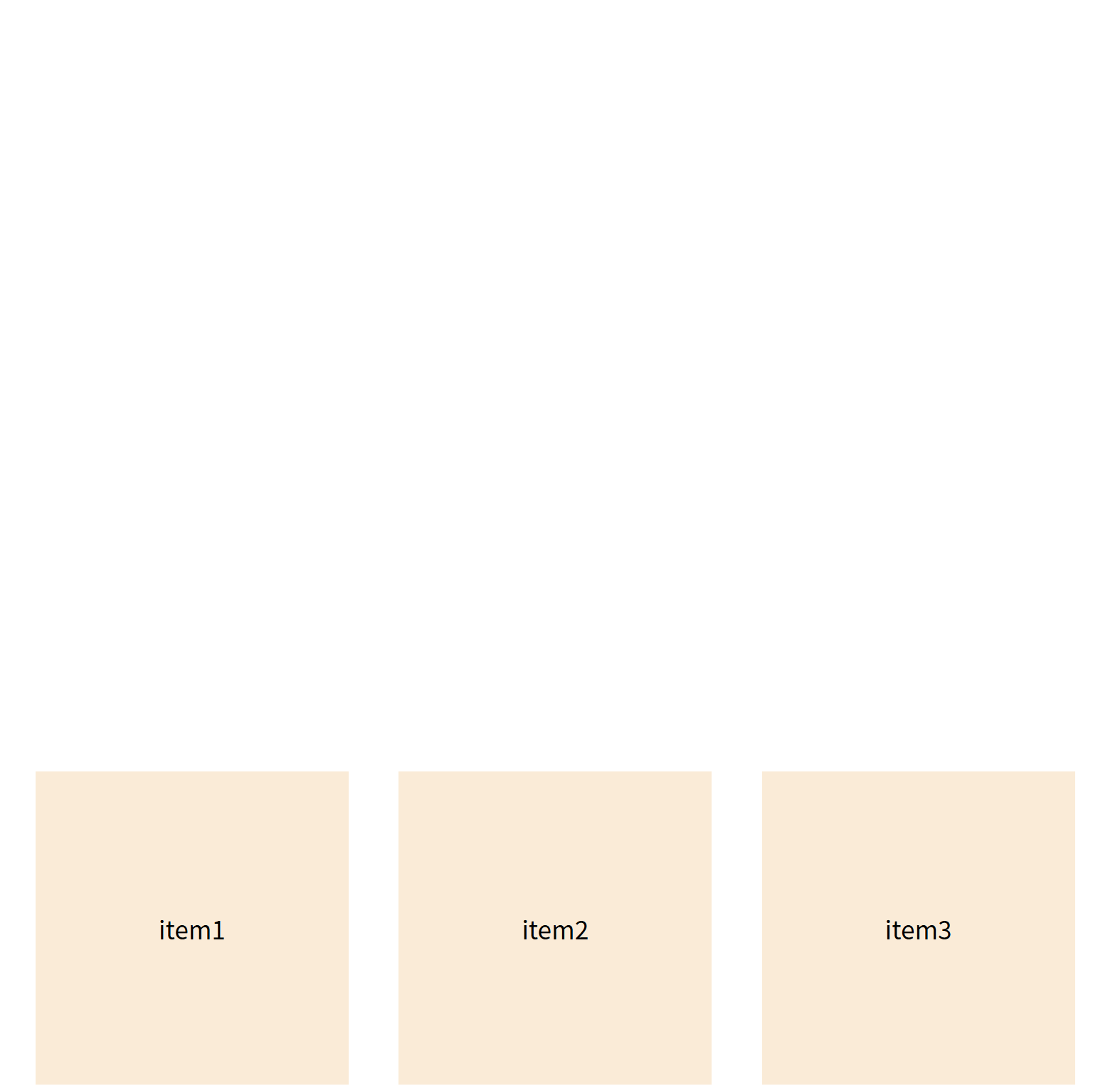
center(垂直居中)
- 项目属性
order- 调整项目顺序(数值越小越靠前).item { order: 0; } .item:nth-child(1){ order: 0; } .item:nth-child(2){ order: -1; }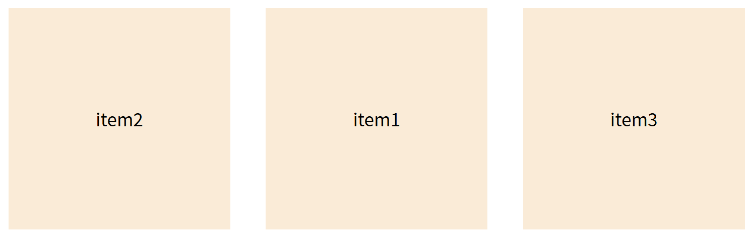
flex-grow- 定义项目放大比例(默认0不放大,即如果存在剩余空间,也不放大).item { flex-grow: 0; } .item:nth-child(1){ } .item:nth-child(2){ flex-grow: 1; } .item:nth-child(3){ flex-grow: 0; }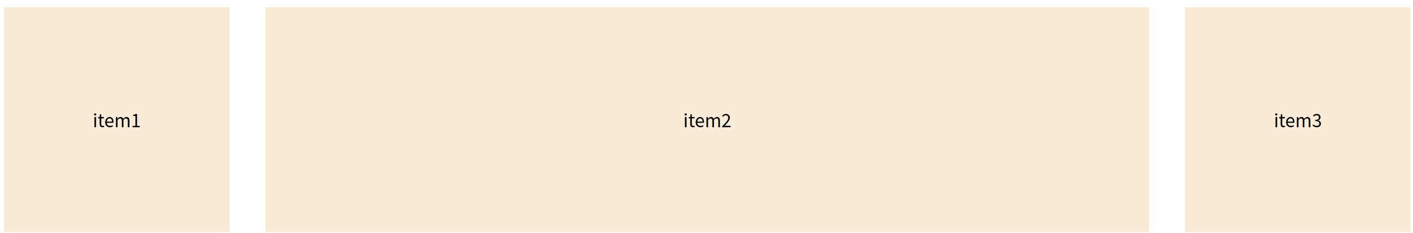
flex-shrink- 定义项目缩小比例(默认1可缩小。即如果空间不足,该项目将缩小。)align-self- 单独设置项目对齐方式(覆盖align-items)
Flex布局技巧: 使用
flex: 1可以快速创建等分空间布局,相当于flex-grow: 1; flex-shrink: 1; flex-basis: 0%
优先使用flex-direction、justify-content和align-items